Interpretation at Glasgow Botanic Gardens
Examples of Interpretation at Glasgow Botanic Gardens.
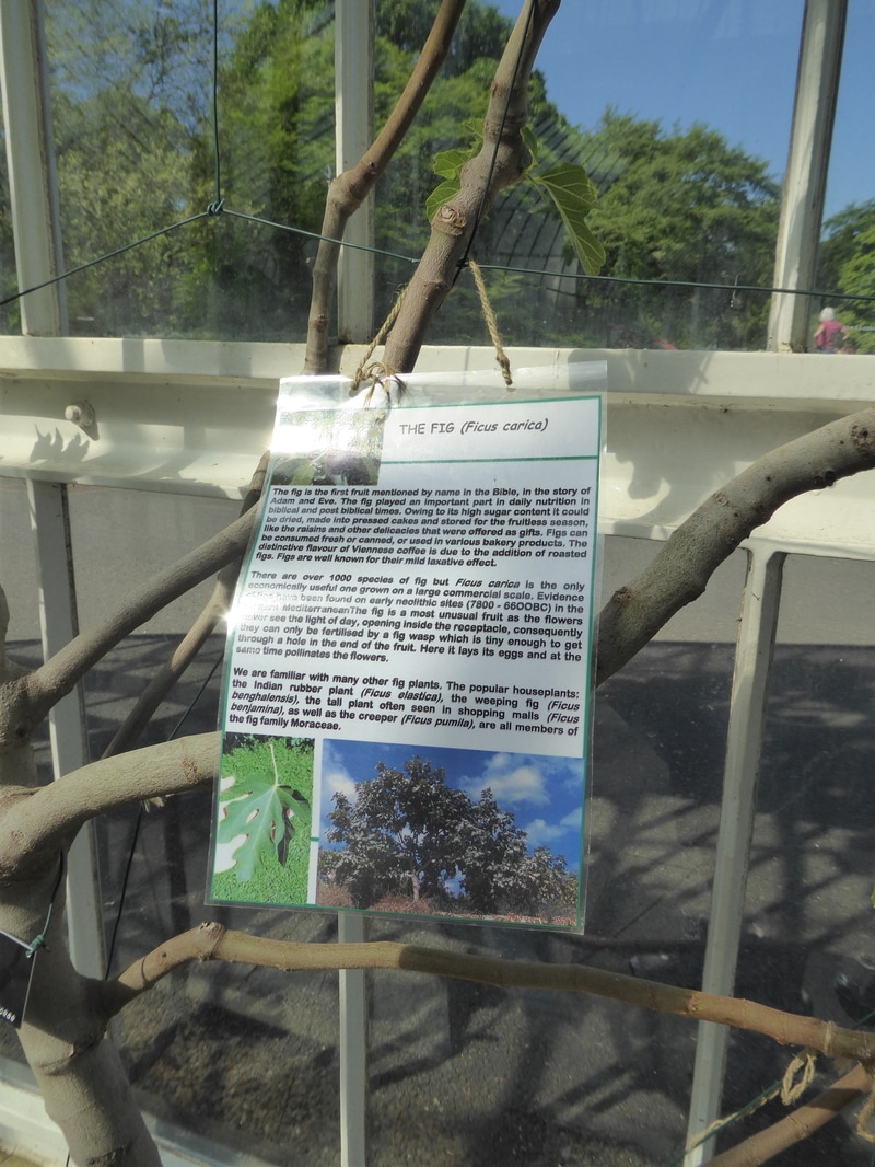
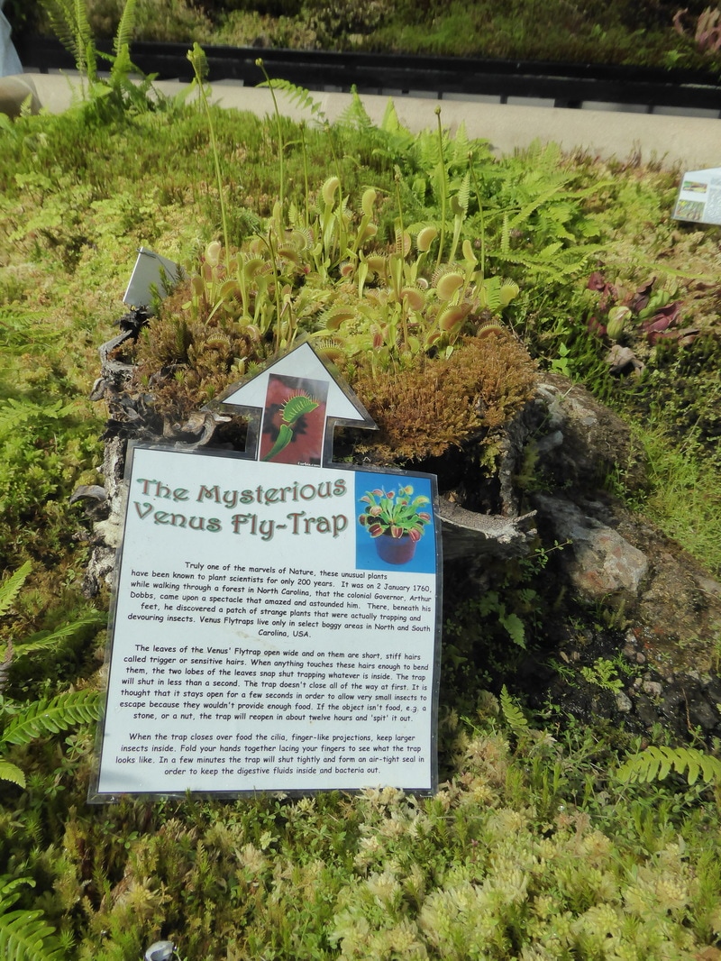
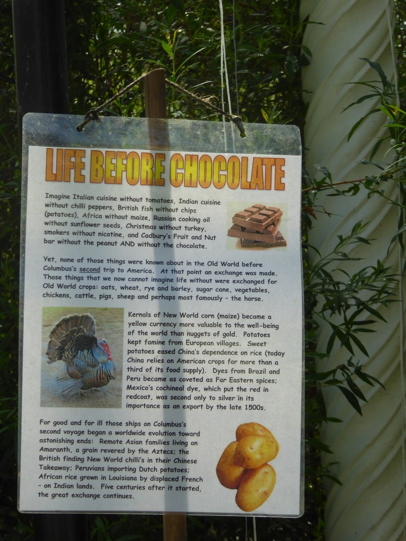
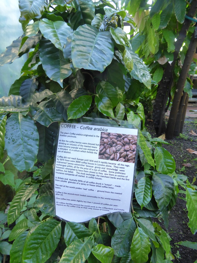
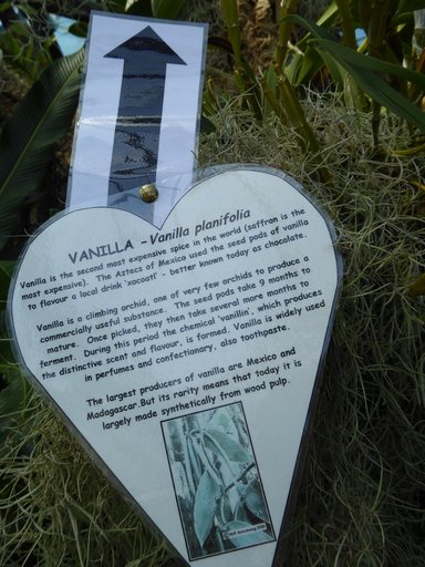
The photos below show the use of stories in explaining the value, importance, ecology, social, cultural and economic impact of plants in the world.
The laminated paper system used is simple, cheap and fast to produce. It is also updateable when new information becomes available and repeatable when it deteriorates. I have promoted this system in other situations because of its simplicity and the ability to quickly update information and produce a completed laminated sign.
It is also very good at times when interpretation is for a limited time, or where experimentation on content of information for the public is being tested for best stories.
Tying a simple natural string to the sign enables it to hang in place. An interesting variation is the use of changing the shape to emphasize a point (See Venus Fly Trap).
The labels used a re relatively small throughout the garden and provide a Botanical name, botanist, and country of origin (See Sundew).
Comments:
Improvements can be made on the laminated paper system at little cost to provide a more professional looking interpretation.
Lets look at the system.
Laminating is good and quick but one thing that can improved the quality is choosing a thicker paper or thin card. This will give a more substantial sign which is less likely to bend and twist. The tie system is OK but the knots need to be hidden behind the sign or knots made in an attractive way. Hooking the sign to a plant may not be the best way of ensuring the sign faces directly to the visitor so a cheap wire stake may be useful. Mind you the thicker paper or light card using the hanging system may look fine.
Layout.
The layouts between these examples is inconsistent and therefore making it difficult for the public to adjust to each sign. I note one of these uses paragraph centering which can make things very hard to read quickly.
Layouts should be simple and consistent with a heading, introduction, information, conclusion and recommendations for further reading/investigation. Placement of photographs should be consistent in the layout and relate to the content.
Headings and/or titles.
On these examples I noted that they are rather old fashioned. The use of Word Art does not really belong here. It detracts from the following text.
Far better to use a larger font set out nicely. If required Word Art can be used to something eye catching but not part of a piece of useful information.
Pictures.
Using a picture as part of the heading actually detracts from the the heading and suggests that the picture is not that important.
Put the picture in the middle of the text where it, the photo, is being described and give it a caption. Photographs are capable of adding to the written information and in most cases will reduce the amount of writing required.
Paragraphing.
In the examples the paragraphing is different for the same institution. This almost says we do not care about how we present information to the public. Consistency is really important in a professional organisation.
Paragraphs have a particular function in writing. They are a sentence or sentences that describe one idea. Paragraphs have functions such as introduction, information (may be a few paragraphs), conclusion and recommendations.
Fonts.
The fonts used are different again showing inconsistency for the organisation. Not only that one is in bold and others are not.
This information is difficult to read quickly if the font is not correct. There are various rules such as headlines should be in Sans Serif and the body in Serif fonts. However this is getting challenged.
By for the best fonts for computers and paper in today's world are Verdana, Trebuchet MS and the serif font Georgia. This page uses Verdana. These are easy to read for both headings and the content.
Changing these to bold can change there readability and it is better not to for the body of the work.
Content.
The content of these examples is not being questioned. Some guidelines are suggested.
All in all the concept is good. Its simple, cheap and can be put up and taken down quickly. It is updateble and repeatable quickly especially if it deteriorates in a humid or harsh climate.
The photos below show the use of stories in explaining the value, importance, ecology, social, cultural and economic impact of plants in the world.
The laminated paper system used is simple, cheap and fast to produce. It is also updateable when new information becomes available and repeatable when it deteriorates. I have promoted this system in other situations because of its simplicity and the ability to quickly update information and produce a completed laminated sign.
It is also very good at times when interpretation is for a limited time, or where experimentation on content of information for the public is being tested for best stories.
Tying a simple natural string to the sign enables it to hang in place. An interesting variation is the use of changing the shape to emphasize a point (See Venus Fly Trap).
The labels used a re relatively small throughout the garden and provide a Botanical name, botanist, and country of origin (See Sundew).
Comments:
Improvements can be made on the laminated paper system at little cost to provide a more professional looking interpretation.
Lets look at the system.
Laminating is good and quick but one thing that can improved the quality is choosing a thicker paper or thin card. This will give a more substantial sign which is less likely to bend and twist. The tie system is OK but the knots need to be hidden behind the sign or knots made in an attractive way. Hooking the sign to a plant may not be the best way of ensuring the sign faces directly to the visitor so a cheap wire stake may be useful. Mind you the thicker paper or light card using the hanging system may look fine.
Layout.
The layouts between these examples is inconsistent and therefore making it difficult for the public to adjust to each sign. I note one of these uses paragraph centering which can make things very hard to read quickly.
Layouts should be simple and consistent with a heading, introduction, information, conclusion and recommendations for further reading/investigation. Placement of photographs should be consistent in the layout and relate to the content.
Headings and/or titles.
On these examples I noted that they are rather old fashioned. The use of Word Art does not really belong here. It detracts from the following text.
Far better to use a larger font set out nicely. If required Word Art can be used to something eye catching but not part of a piece of useful information.
Pictures.
Using a picture as part of the heading actually detracts from the the heading and suggests that the picture is not that important.
Put the picture in the middle of the text where it, the photo, is being described and give it a caption. Photographs are capable of adding to the written information and in most cases will reduce the amount of writing required.
Paragraphing.
In the examples the paragraphing is different for the same institution. This almost says we do not care about how we present information to the public. Consistency is really important in a professional organisation.
Paragraphs have a particular function in writing. They are a sentence or sentences that describe one idea. Paragraphs have functions such as introduction, information (may be a few paragraphs), conclusion and recommendations.
Fonts.
The fonts used are different again showing inconsistency for the organisation. Not only that one is in bold and others are not.
This information is difficult to read quickly if the font is not correct. There are various rules such as headlines should be in Sans Serif and the body in Serif fonts. However this is getting challenged.
By for the best fonts for computers and paper in today's world are Verdana, Trebuchet MS and the serif font Georgia. This page uses Verdana. These are easy to read for both headings and the content.
Changing these to bold can change there readability and it is better not to for the body of the work.
Content.
The content of these examples is not being questioned. Some guidelines are suggested.
- For adults use simple language that can be easily read by a 12 year old. If aiming at a younger audience quite different language can be used
- Keep technical language and terms to a minimum. You are not writing for technically minded people
- Stimulate interest in finding out more
- Encourage people to seek followup information if they are interested in doing so
- Use shorter sentences and paragraphs for ease of reading.
- Edit out unnecessary words
All in all the concept is good. Its simple, cheap and can be put up and taken down quickly. It is updateble and repeatable quickly especially if it deteriorates in a humid or harsh climate.